Indulging in fast food every once in a while can feel like a guilty pleasure for many people. Among popular chain restaurants, Wendy’s has long been a favorite for its classic menu and recognizable branding.
But beyond the burgers and fries, some of the world’s most famous logos hide subtle design details that most people walk past without ever noticing.
The Hidden Detail Inside the Wendy’s Logo
The iconic Wendy’s logo features a smiling red-haired girl, inspired by the daughter of the company’s founder, Dave Thomas. Her friendly appearance is instantly recognizable across locations worldwide.
However, there is a lesser-known detail hidden in plain sight.
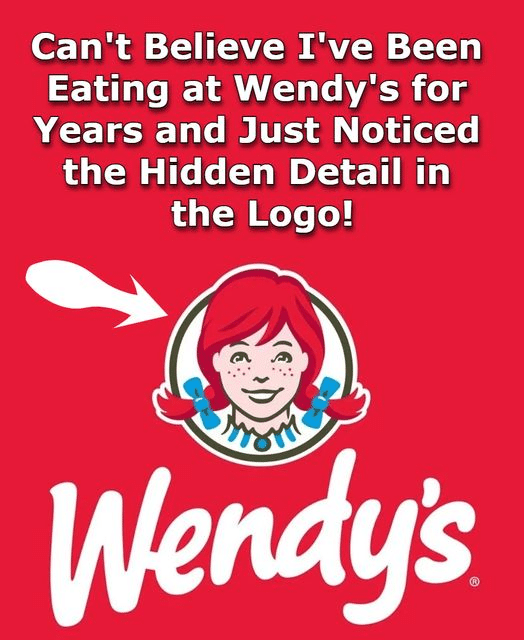
If you look closely at the ruffled collar of her dress, you can spot the word “MOM” subtly embedded within the design.
This hidden message is often overlooked, but it adds a layer of warmth and personal meaning to the brand identity—tying back to family and home-style values.
Clever Symbolism in the Subway Logo
Another well-known example of hidden design meaning comes from Subway.
At first glance, the logo simply features the brand name with stylized arrows.
But a closer look reveals that the “S” and “Y” include two arrows pointing in opposite directions.
These arrows symbolize movement—representing both entry and exit, much like a subway system. It reflects the idea of convenience, flow, and fast service, aligning perfectly with the brand’s identity.
A Nod to Culture in the Toblerone Logo
Not all hidden details come from fast food brands. Some are rooted in cultural heritage and geography.
The famous chocolate brand Toblerone features a mountain in its logo, representing the Swiss Alps and the brand’s origin in Bern, Switzerland.
But if you look closely at the mountain silhouette, you may notice a hidden shape of a bear—an homage to Bern’s nickname as the “City of Bears.”
This subtle design choice connects the brand to its homeland, adding cultural depth to its identity.
Why These Hidden Details Matter
These examples show that logos are often more than simple visuals. Designers frequently embed symbolism, cultural references, and personal meaning into brand identities.
In marketing and branding strategy, such elements help create emotional connections with consumers, making logos more memorable and meaningful.
Even major global companies rely on these subtle design decisions to strengthen recognition and storytelling.
Final Thoughts: More Than Just Logos
Once you notice these hidden details, it becomes difficult to “unsee” them. What once looked like simple branding now reveals layers of creativity and intention.
From Wendy’s subtle “MOM” message to Toblerone’s hidden bear, these small design choices remind us that even everyday visuals can carry surprising depth.
And the next time you see a familiar logo, you might find yourself looking a little closer.